Tag Archive for: Color

Posts

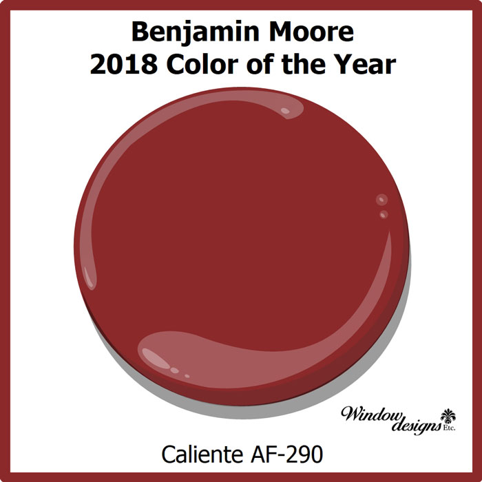
Benjamin Moore Caliente is the 2018 color of the year.  Leading paint company, Benjamin Moore made the announcement on October 11, 2017 in a lavishly color filled party at the Guggenheim.

Benjamin Moore 2018 Color of the Year

Benjamin Moore Caliente Af290 Color of the year 2018 See more detaiils on www.windowdesignsetc.com

Pin this ↑

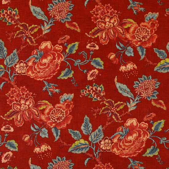
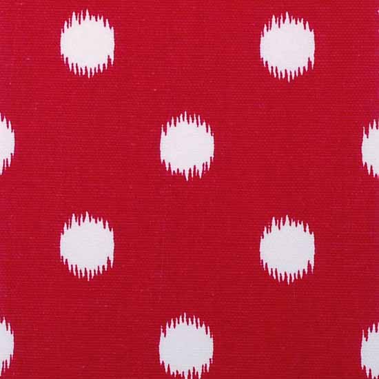
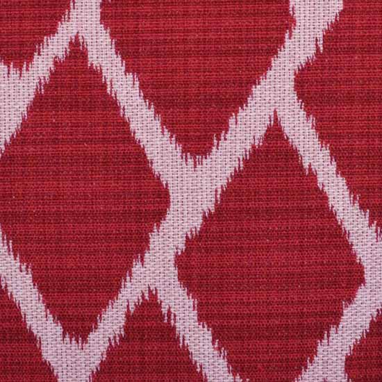
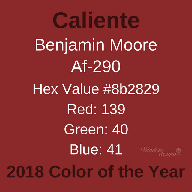
Benjamin Moore Caliente is a rich red with hints of orange.  Caliente AF-290 is one of the Benjamin Moore Affinity colors.  Affinity colors are known for their depth and richness of color.  Caliente is a rich and deep color.

Benjamin Moore describes Caliente as hot, passionate and sexy.  They behold it as one of their most loved reds.  Caliente, a Spanish word, has lots of personality.  It is the perfect hue for you if you like to the warmer tones of red.

Benjamin Moore Caliente Af-290

Benjamin Moore Caliente 2018 Color of the Year Af290

Pin this ↑

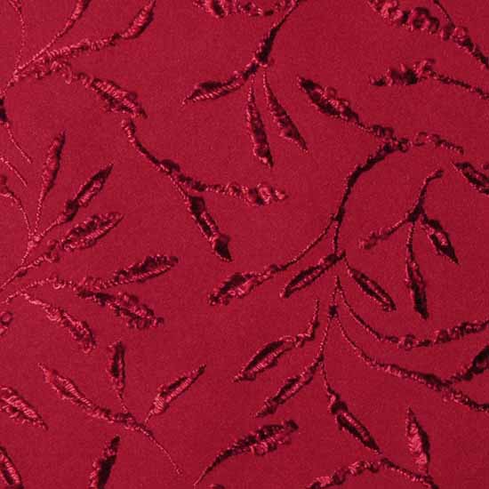
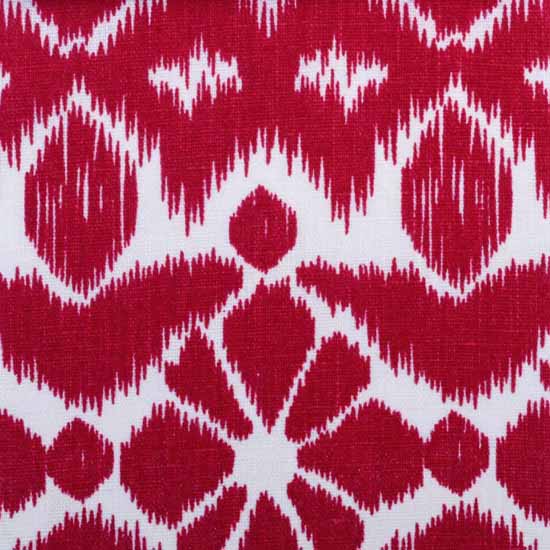
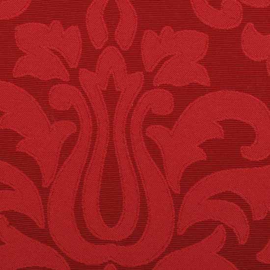
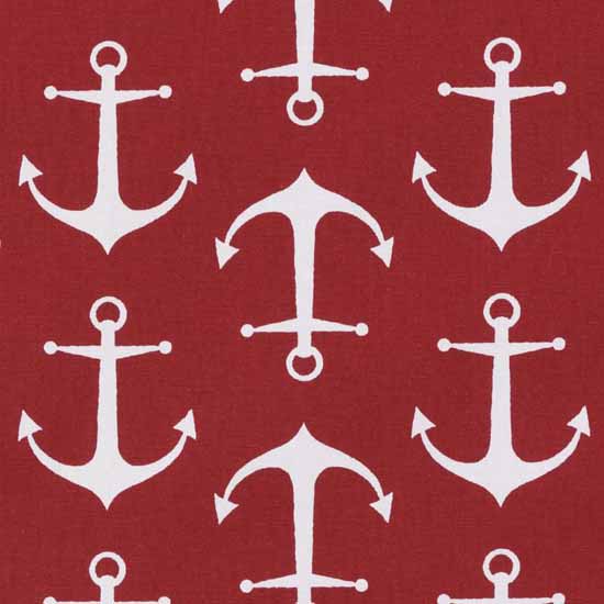
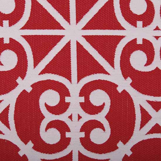
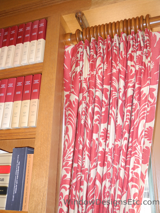
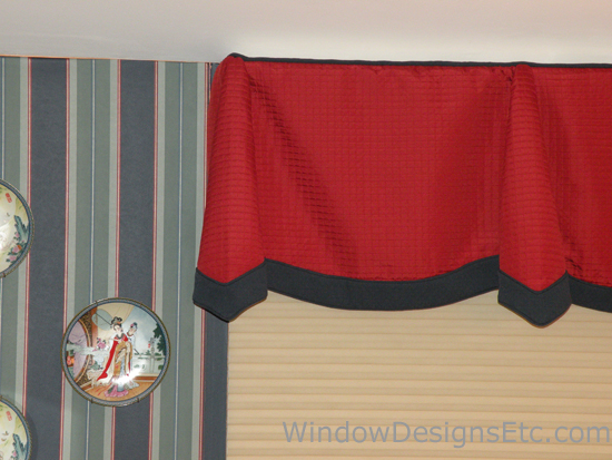
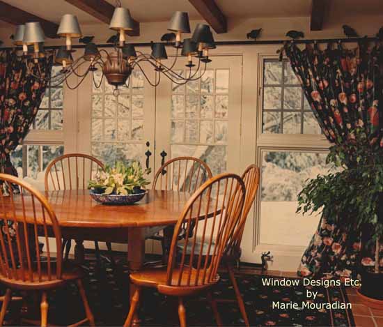
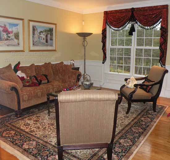
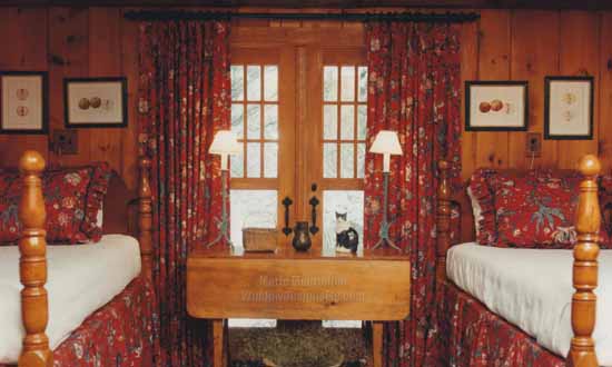
A custom window treatment in a Princeton, MA dining area features an RM Coco fabric in color Caliente.  The large eat-in kitchen needed some warming up. The addition of Caliente creates a very warm and friendly family atmosphere.  See more details on this kitchen in my portfolio.

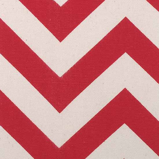
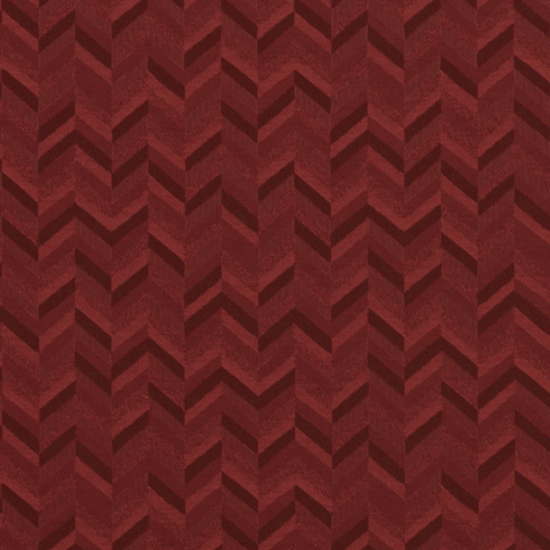
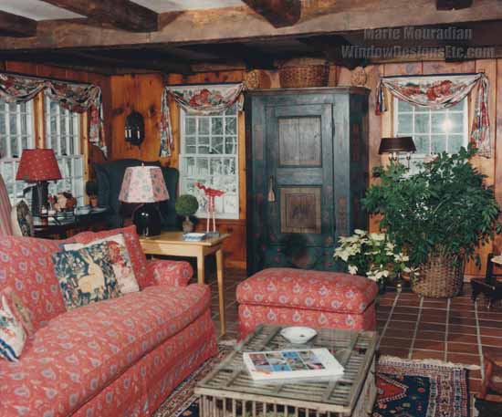
Caliente is a ball of fire, like the colors in a blazing inferno. This makes it the ideal color for an accent wall in a family room.  The addition of this blazing red will warm up any room.

Bold and brazen Caliente is best in small doses.  It captures so much of your attention, a whole room painted Caliente may be too much.  

It works best when combined with other color schemes.  

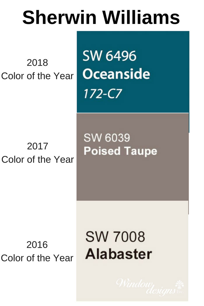
Past Benjamin Moore Colors 2018-2017-2016

Benjamin Moore Caliente 2018 - Shadow 2017 - Simply White 2016

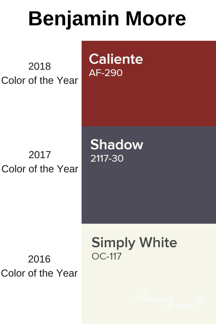
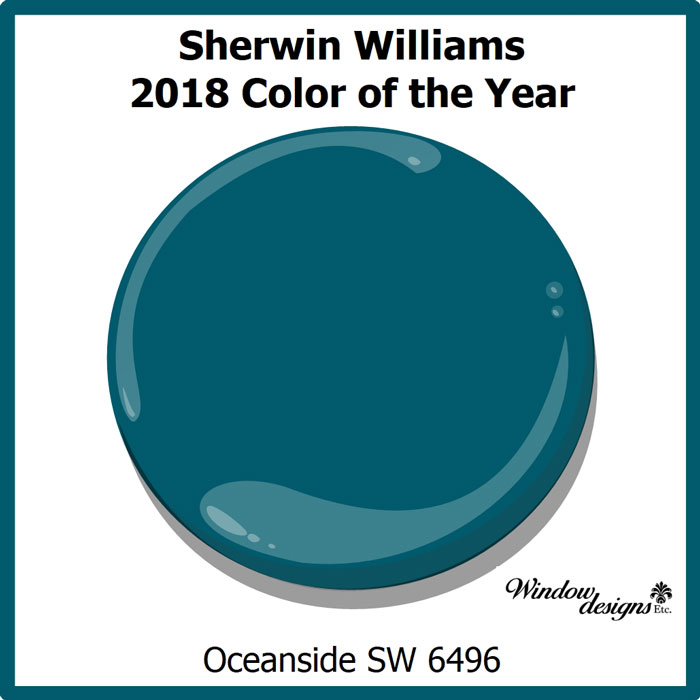
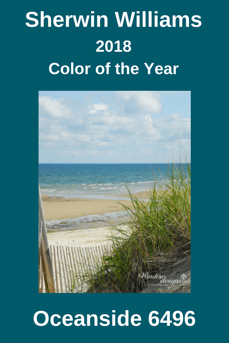
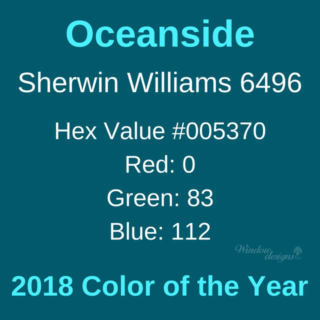
Looking back at the past selections of Benjamin Moore color of the year, Caliente is a welcome change.  This change was also noted in the recent selection by Sherwin-Williams of Oceanside as their pick for 2018. 

Benjamin Moore Shadow 2117-30 selection for 2017 is allusive and mysterious.  (A great color in certain situations, but this is a rather subdued and depressing color to me)

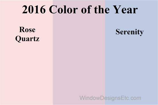
2016 saw a safe and ultra neutral selection of Simply White OC-117.  (Talk about NOT wanting to make a statement.  Let’s just stay neutral and get along with all the other 3,500 Benjamin Moore colors)

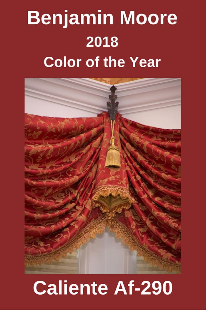
Caliente Af-290 Color Values

Benjamin Moore Caliente af290 color values hex and rgb 2018 color of the year

Pin this ↑

Ellen O’Neill, Benjamin Moore Director of Strategic Design Intelligence describe Caliente as “Strong, radiant and full of energy, Caliente AF-290 is total confidence. It is pleasing, passionate and makes people feel special, like ‘red carpet treatment.”

Caliente is going to uplift people’s spirits.  It’s a happy color and this designer is excited to bring it to your decor.

It’s the perfect color to add warmth to your New England home.  I think you’re going to love it!

Designer Note

Benjamin Moore Caliente is their 2018 Color of the Year.

This does not mean you should change all of the walls in your home to Caliente.

Begin adding small amounts of the IT color into your home and even your wardrobe.

A pillow here, a throw there, some pottery or fresh towels for the powder room.

Keep your eyes open for this new color.  You will begin noticing it everywhere.

***Please be aware that computer and mobile device screens display color differently than in person***

Contact me if you would like your own paint swatch.

I’m ready to help you bring Caliente into your home and office.

Contact me today.

Sherwin-Williams Oceanside is the 2018 color of the year.  Leading paint company, Sherwin-Williams made the announcement on October 3, 2017.

Sherwin-Williams 2018 Color of the Year

Sherwin-Williams Oceanside 2018 color of the year SW 9496 Read more about Oceanside on the blog Windowdesignsetc.com

Pin this ↑

Sherwin-Williams Oceanside SW 6496 is a combination of rich blue and jewel-tone green.  It is a deep and complex color that has a sense of familiarity with a touch of the unknown.

According to Sherwin-Williams, Oceanside contains blue which is the favorite color worldwide.  Blues evoke intelligence, honesty and interest.

Sherwin-Williams Oceanside

Pin this for future reference.


Oceanside Cape Cod Bay Sherwin Williams 2018 Color of the Year

Oceanside is marine-inspired, like the colors in the depths of the ocean.  You can see the color Oceanside in the waters of Cape Cod Bay in the photo above.

It is universal when it comes to design style, is evident in what’s old and new.  It transcends from traditional to contemporary design styles.

  • Painting your front door Oceanside will create a welcoming statement.  
  • An office in this rich blue-green will boost creative thinking and clarity.
  • Adding Oceanside to your bedroom, a yoga room or a reading area will stimulate meditation and self-reflection.

 Past Sherwin-Williams Colors 2018-2017-2016

The selection of SW 6496 Oceanside as the color of the year is quite a departure.  Near neutrals have been dominant the past few years.

I couldn’t be happier! 

Let’s get out of this “safe” neutral color zone.

We need to put some personality, life and happiness back in our homes.


Past Sherwin Williams' Color of the year 2018-Oceanside 2017-Poised Taupe - 2016-alabaster


2017 color of the year is Poised Taupe, a neutral blend of warm brown and cool grey.  Poised Taupe SW 6039 is a medium color tone that is natural, weathered and balanced.

Alabaster SW 7008 is the Sherwin-Williams 2016 color of the year.  Alabaster offers a sense of personal solace and rest for weary minds.  2016 was an election year creating a lot of commotion and overstimulation. (How many times a day do you look at your phone?) Alabaster is a true neutral.

I repeat, safe, neutral and boring.


Oceanside SW 6496 Color Values

Sherwin Williams Oceanside color values hex and rgb


“People today have a growing sense of adventure, and it is making its way into even the coziest corners of our homes. We are craving things that remind us of bright folklore, like mermaids and expeditions across continents,” says Sue Wadden, director of color marketing at Sherwin-Williams.

Sherwin-Williams Oceanside has depth of color.  It is versatile across design styles.  Oceanside is easily incorporated into many color schemes.  Yes, it will liven up even your cool gray walls!

Expect to see deep blue with a touch of green all across the home decor industry.  

Designer Note

Sherwin-Williams Oceanside is their 2018 Color of the Year.

This does not mean you should change all of the walls in your home to Oceanside.

Begin adding small amounts of the IT color into your home and even your wardrobe.

A pillow here, a throw there, a picture frame, some pottery or fresh towels for the powder room.

Keep your eyes open for this new color.  You will begin noticing it everywhere.

***Please be aware that computer and mobile device screens display color differently than in person***

Contact me if you would like your own paint swatch.

I’m ready to help you bring Oceanside into your home and office.

Contact me today.


Rose Quartz and Serenity Blue are Pantone 2016 color of the year!  Pantone, the leading authority on color, made the announcement early this morning.

Rose Quartz and Serenity Blue combined. Pantone 2016 Color of the year. - more on the blog WindowDesignsEtc.com.


It’s twins!  This is the first time Pantone has chosen two colors to share the spotlight.

This is a softer take on color for 2016 and I LOVE it!

Pink is my signature color.  Rose Quartz is very close to the blush pink in my blog heading and the background design.

Read more about my love for pink.

.

Rose Quartz and Serenity Blue are meant to be used in conjunction with one another.

The Executive Director of Pantone Color Institute describes Rose Quartz and Serenity as “An inherent balance between a warmer embracing rose tone and the cooler tranquil blue, reflecting connection and wellness as well as a soothing sense of order and peace”.

Homeowners often tell me they want their rooms to be warm, inviting and peaceful.

We are looking to our home to be a secure and calm respite away from the modern day stresses of the world.

That’s what your home should be. A place to be at ease and be nourished by an inviting environment.

.

Rose quartz and serenity blue 2016 Cape Cod hydrangeas in pink, blue and purple. WindowDesignsEtc.com


Cape Cod hydrangeas in shades of soft pink, cool blue and their blend to a light lavender.

Nature always gets it right!


Rose Quartz and Serenity Blue Color Values


Rose Quartz Pantone, Hex and RGB values Pantone 2016 Color of the year. - more on the blog WindowDesignsEtc.com.Serenity blue Pantone, Hex and RGB values Pantone 2016 Color of the year. - more on the blog WindowDesignsEtc.com.


Color values of  Rose Quartz and Serenity in Pantone, Hex and RGB

I often use the color’s formula when producing design renderings with my graphic design software.

It  helps the client to visualize the completed room.

While it will never be the exact color on the screen or phone, it is a close representation.


Defining Rose Quartz and Serenity Blue

Rose Quartz and Serenity blue word cloud - descriptive words. Pantone 2016 Color of the year. - more on the blog WindowDesignsEtc.com.


A collection of descriptive words for Rose Quartz and Serenity, Pantone 2016 Colors of the Year.

Rose Quartz and Serenity are described as a fusion of colors that exemplify wellness, balance, calm, compatibility, duality, tranquility, mindfulness and security.

Read more of why Pantone selected Rose Quartz and Serenity Blue for the Color of the Year.


Pantone decides on the Color or Colors of the Year by forecasting the upcoming trends.

They study global markets, events, behaviors, market trends, news stories, developments and yes, politics.


Pink and Blue painted sky at the Venetian in Las Vegas. See more at WindowDesignsEtc.com


The sky turns to a breathtaking combination of rose quartz and serenity blue at sunset. This is depicted here in the ceiling at The Venetian in Las Vegas, NV.  A comforting respite from the noise and activity of a playful city.

We’re looking to our homes for comfort and relaxation, a quieter feeling, like a serene sunset.


Pantone 2015 Color of the Year


Marsala the Pantone Color of the Year for 2015. It's all about wine, cheers! - Marie Mouradian WindowDesignsEtc.com - Marsala, Pantone 2015 Color of the Year


This past year’s color was Marsala.  A redish brick color that is welcoming and friendly.  Marsala works nicely with the softness of Rose Quartz.  Serenity used as a contrasting accent color would balance out the color scheme.


For 2016, I’ll keep a close watch on Rose Quartz and Serenity.

Pin this to Pinterest to refer back to.


Rose Quartz and Serenity blue Pantone, Hex and RGB values Pantone 2016 Color of the year. - more on the blog WindowDesignsEtc.com.


Visit the Pantone 2016 Color of the Year Pinterest board to see more examples of these popular colors.


Where will you use Rose Quartz and Serenity in your home?

Did you find this post interesting?  

What did you learn?

Please share this with your friends on Social Media (buttons are below)

xoxo

Marie

Contact me today, I will guide you in the best decisions to make your house into a home you love to live in.

Hiring a professional saves you time, frustration and money. You, your family, your house and office deserve it!

Red – The color of love

Red is the color we pay the most attention to. It’s the most energetic color, it’s hot and dramatic.

Red is the color of love, passion, and desire; red hearts, red roses.

A “red-letter day” is terrific; wearing a “scarlet letter” marks you as untouchable.

On the flip side, red is for danger, speed, and anger.  It increases the heart rate and stimulates the appetite.

Read more on the Emotions of Color and Creative Ways to Use Red in Your Home.

Favorite RED fabrics from Duralee

From the Sussex Embroideries collection, this polyester has a drapable sheen with embroidered leaves making it spring all year round.

Embroidered red fabric. Favorite red fabrics by Duralee on Window Designs Etc. By Marie Mouradian

Red combined with white in a chevron in durable cotton duck fabric.

Red and white chevron. Favorite red fabrics by Duralee on Window Designs Etc. By Marie Mouradian


 Looking for a super durable upholstery fabric?  This woven jacquard is the solution.  It passes durability, fire code and pilling tests.  So many shades of red in this herringbone pattern.

Color blocked herringbone red fabric. Favorite red fabrics by Duralee on Window Designs Etc. By Marie Mouradian


 Traditional Ikat is updated in this red and white multi-purpose 100% linen.

Favorite red fabrics by Duralee on Window Designs Etc. By Marie Mouradian


Dramatic and elegant red in this striking damask.

Red damask. Favorite red fabrics by Duralee on Window Designs Etc. By Marie Mouradian


Who doesn’t love a nautical fabric?  100% cotton white anchors on a red background. Summer is just around the corner. Anchors away!

Favorite red fabrics by Duralee on Window Designs Etc. By Marie Mouradian


An indoor outdoor fabric from the Duralee Pavilion Collection.  This red and white geometric pattern will brighten up an outdoor space.  The pattern reminds me of a garden gate.

Favorite red fabrics by Duralee on Window Designs Etc. By Marie Mouradian


Florals are making a comeback.  This one would work well with reliable denim.

Red floral fabric. Favorite red fabrics by Duralee on Window Designs Etc. By Marie Mouradian


Feeling dotty and spotty. This red and white polka-dot fabric is fun and playful.

Red with white polka dots. Favorite red fabrics by Duralee on Window Designs Etc. By Marie Mouradian


Can you say durable? This polyester suede in Cardinal is a powerhouse for upholstery. The price point is very reasonable too!

Favorite red fabrics by Duralee on Window Designs Etc. By Marie Mouradian


Diamonds are a girls best friend in any color but red makes them more luscious.

Favorite red fabrics by Duralee on Window Designs Etc. By Marie Mouradian


See more fabrics from the extensive collection by Duralee Fabrics.


Where would you use these red fabrics in your home?

xoxo

Marie

Contact me today, I will guide you in the best decision to make your house into a home you love to live in.

Hiring a professional saves you time, frustration and money.

You, your family, your house, and office deserve it!

Today is National Wear Red Day.  The American Heart Association’s campaign “Go Red For Women” brings attention to heart disease and stroke in women.

Heart disease and stroke cause 1 in 3 women’s deaths each year. Learn more at www.goredforwomen.org

Decorate With RED At Home

Decorate with Red at Home .Red and white damask patterned pleated drapes on wooden rod. Designed and Created by Window Designs Etc. By Marie Mouradian

Red damask patterned drapes have lots of power in this Federal Court judge’s private Chambers in Worcester, MA.  While the office is quite spacious, this small vignette captures the volumes of red law books that match the drapes perfectly.

decorate with Red at Home. Red quilted scallop and cone valance with navy blue banding. Underneath is a Hunter Douglas Duette® Architella honeycomb shade. Designed and Created by Window Designs Etc. By Marie Mouradian

A scallop and cone valance of vibrant red quilt fabric has a navy band as trim.  My Rutland, MA clients love the stripe wall covering that still looks fresh.  Originally the custom window treatments were done in the cool green to bring the lush landscaping in. The new red fabric helps to warm up the room. The use of red has the power to warm and draw attention.  Hunter Douglas Duette® Architella honeycomb shades help keep the cold drafts out.

Decorate with red at home. Custom blocked rectangle pillow in red and stripe. Designed and created by Window Designs Etc. By Marie Mouradian

Are you not daring enough to go with red at the window?  This custom color blocked pillow at a Holden, MA project adds a punch to the neutral sofa. See lots more pillows here and here. 

More ways to decorate with red

Red at Home. Red and gold elaborate and formal swags and cascades on a double window. Tassel trim finished the edges and center tassels and loop complete the center. Designed and Created by Window Designs Etc. By Marie Mouradian

Red creates drama in this Shrewsbury, MA formal dining room.  This is a large room with only one double window, the window treatment has to be bold and powerful. A red and gold diamond embroidery fabric makes up overlapping swags and cascades.  Matching tassel trim finishes the edges.  Large tassels and knotted cord bring focus to the center of the window. Hunter Douglas Nantucket™ soft shadings provide privacy and light control.

Decorate with red at home. Hunter Douglas wood blinds with decorative red tape. Designed by Window Designs Etc. By Marie Mouradian

Decorate with red as an accent to these Hunter Douglas natural wood blinds in Sterling, MA.  Decorative tapes on blinds add style and makes an impact with color.

decorate with Red at Home. Window and door with Hunter Douglas Luminette® and Silhouette. Custom valance is trimmed in vibrant red. Check/plaid red tied back curtains. Designed and Created by Window Designs Etc. By Marie Mouradian

Bold crimson trims the gathered valance so your eye carries across the combination window and door wall.  The red banding also serves as a link between the check pattern of the drapes and the stripe of the valance.  Hunter Douglas Silhouette® window shadings and Luminette® privacy sheers provide light control and privacy.  The view beyond is the ocean in Rye, NH.

 I have my RED on, do you?

xoxo

Marie

Contact me today, I will guide you in the best decision to make your house into a home you love to live in.

Hiring a professional, saves you time, frustration and money.

You, your family, your house and office deserve it!

How about a New England Patriots room?

All of the cheering and praying in family rooms across New England helped the Patriots win the championship.

Before the big game, I designed a room for each team’s fans.  Check them out here.

I’ve made some more customization to the Patriots fan room.

Your home should include what you are passionate about!

A Dedicated New England Patriots Room

A New England Patriots room designed for the ultimate football fan. Window Designs Etc. by Marie Mouradian

xoxo

Marie

Contact me today, I will guide you in the best decision to make your house into a home you love to live in.

Hiring a professional, saves you time, frustration and money.

You, your family, your house and office deserve it!

It’s Super Bowl Sunday.  East meets west as the New England Patriots take on the Seattle Seahawks.

I’ve been glued to the TV all afternoon watching the pregame hype.

The colors of the teams have inspired me to design a room that any true fan from each team would watch the game in.

Super Bowl 49

Seahawks Super Bowl Room Design

Super Bowl 49 Seattle Seahawks inspired room design. More on the blog Window Designs Etc. by Marie Mouradian

or

Patriots Super Bowl Room Design

Patriots super bowl room design. Super Bowl 49 New England Patriots inspired room design. More on the blog Window Designs Etc. by Marie Mouradian

What does the room you’re watching the game look like?

Give your vote below in the comments.

In case you weren’t aware, I LOVE football!

xoxo

Marie

Contact me today, I will guide you in the best decision to make your house into a home you love to live in.

Hiring a professional saves you time, frustration and money.

You, your family, your house and office deserve it!

Please share this post

It’s time to look back at the designs of the past. This 1980’s bedroom shows the era’s style.  Thirty-three years ago, when I started Window Designs Etc, the styles were VERY different than today.

Fortunately, I invested in some good photography for my, then hand carried a leather portfolio.

The photos do tell the story of how interior design and custom window treatments have evolved over the years.

1980’s Bedroom Is Out Of Style

1980's Bedroom - #TBT in interior design. Peach and green bedroom from the 80's More on blog Window Designs Etc. by Marie Mouradian

At the time this was a well-designed master bedroom in THE most exclusive neighborhood in Shrewsbury, MA.

The silk screen is still beautiful as a headboard but that’s the only piece that would transform into today’s homes.

What’s dated in this room

  • The window treatments are swags and cascades over fabric covered PVC with ball finials.  See more #TBT window treatments using PVC here and here.
  • The shades are single layer pleated shades. Today’s shades are much nicer looking honeycomb like Hunter Douglas Duette® Architella.
  • Moulding with stain is not in style here (it is still nice in some room designs) Paint is better
  • The walls are light pastel peach.  More color, please.
  • The coverlet on the bed, while it looks nice, was a 14-ounce fill king size reversible monster.  I remember that thing must have weighed 35 lbs!
  • Pillows – Oh so few and too small, let alone that tied green wrap on the square pillows look very skimpy.  Bring on the large European pillow shams.
  • Those night stands are way too small.
  • The “flowering” tree in the corner…throw it away and add in some lush live greenery.
  • The colors peach and green are passe’.

I am sure this room no longer exists.  The family has since moved.  I’m sure the new owners have a stylish up to date master suite.

Do YOU still have peach and green in your home?

xoxo

Marie

Contact me today, I will guide you in the best decision to make your house into a home you love to live in.

Hiring a professional saves you time, frustration and money.

You, your family, your house, and office deserve it!


Decorating with black floral chintz tied tab panels in a dining room - See more at www.WindowDesignsEtc.com by Marie Mouradian

Decorating With Black

Decorating with black details make this Southbridge, MA dining room anything but dark and boring.

Custom gathered tied tab drapes in a vibrant black floral chintz frame the view.

A whimsical hand crafted wooden drapery rod is a perch for custom cut black bird silhouettes.

The coordinating Wilton Weave area rug repeats the black with vibrant floral pattern.  The rug softens the terra cotta floor and anchors the table.

White walls and trim are a nice backdrop to the striking black accents.

Tips For Decorating With Black

  • Black never goes out of style. It’s timeless!
  • Combining black with vibrant colors makes them pop.
  • Black is a universal color across all styles.
  • Artwork with a black frame looks fabulous.
  • Everything matches with black.
  • Afraid of commitment to decorating with black?  Use black accessories in wrought iron.
  • Black brings out the grain in wood.
  • Contrary to what you may think, black makes small rooms seem larger.  My favorite place to use black on the walls is a small powder room.
  • Black is glamorous.
  • Consider painting an accent wall in high gloss black for extra drama.
  • Decorating with black appeals to both men and women.

Follow These Sites For Decorating With Black Inspiration

The Skeptic’s Guide To Black Paint

Warning – These Rooms Will Make You Regret Your White Walls

8 Black Rooms That Aren’t Scary


xoxo

Marie

Contact me today, I will guide you in the best decision to make your house into a home you love to live in.

Hiring a professional saves you time, frustration and money.

You, your family, your house and office deserve it!

Please share this post

Bringing the decorating showroom to you in the Worcester, Massachusetts area including Holden, Princeton, Sterling, Rutland, Paxton, West Boylston, Shrewsbury, Boylston, Grafton, Sutton, Millbury, Lancaster, Leominster and beyond.

Marsala Pantone 2015 Color of the year "A natural robust and earthly wine red, Marsala enriches our minds, bodies and souls" - Pantone.com - Marie Mouradian WindowDesignsEtc.com - Marsala, Pantone 2015 Color of the Year

Yesterday Pantone, the leading authority on color, announced Marsala Pantone 2015 Color of the year.  They describe Marsala as “A natural robust and earthly wine red, Marsala enriches our minds, bodies and souls”.  Pantone.com

Marsala Pantone 2015 Color of the year -Pantone color deck with Marsala circled.- Marie Mouradian WindowDesignsEtc.com - Marsala, Pantone 2015 Color of the Year

At first, I thought it was in the brown family so I got out my Marsala Pantone color deck.  I’ve circled it above, you can see it is in the red section with just enough brown added to make it warm and friendly.

Marsala Pantone Paint

Marsala Pantone 2015 Color of the year Close matches of some commercial paint companies to Pantone Marsala. Benjamin Moore - warm earth, Glidden - Rusty red, Behr - Pompeian Red - Marie Mouradian WindowDesignsEtc.com - Marsala, Pantone 2015 Color of the Year

 Close matches of some commercial paint companies to Marsala Pantone. Benjamin Moore-warm earth, Glidden – Rusty red, Behr – Pompeian Red.

In-person interior design consulting, especially for color, will never be replaced by the internet.  True color is one of the most difficult to convey on the computer screen since monitors have differing color settings.

Keeping this in mind, Marsala sometimes appears rust, red or brown.  Holding a color sample in your hand is best so pick up one of the paint samples or order a swatch directly from Pantone.

Marsala Pantone 2015 Color of the Year

Color Values of Marsala Pantone 2015 Color of the year, Hex and RGB. - Marie Mouradian WindowDesignsEtc.com - Marsala, Pantone 2015 Color of the Year

Color Values of Marsala in Pantone, Hex and RGB.

I use the color’s formula when specifying in my graphic design software.  While it will never be the exact color on the computer screen or phone, it is a close representation.

Marsala Pantone 2015 Color of the year A collection of descriptive words I found on social media from interior designers across the country. Love it or hate it, Pantone's Marsala is it for 2015. - Marie Mouradian WindowDesignsEtc.com - Marsala, Pantone 2015 Color of the Year

A collection of descriptive words I found on social media from interior designers across the country.  Love it or hate it, Pantone’s Marsala is it for 2015.

Nail lacquer by OPI aptly named "OP-I Love This Color" - Marie Mouradian WindowDesignsEtc.com - Marsala, Pantone 2015 Color of the Year

Nail lacquer by OPI aptly named “OP-I Love This Color”

Uses of Marsala Pantone

Hints of Marsala Pantone 2015 Color of the year in the sofa and carpet are brought to the window in embroidered silk swags and cascades. - Marie Mouradian WindowDesignsEtc.com - Marsala, Pantone 2015 Color of the Year

A Sutton, MA living room uses Marsala in the window treatments. Silk swags and cascades with embroidery highlight the hints of Marsala Pantone in the sofa and carpet.

Marsala Pantone 2015 Color of the year walls were the ideal selection for this re-purposed formal living room - A wine tasting room!. The gold and taupe of the custom draperies pair well with Marsala. - Marie Mouradian WindowDesignsEtc.com - Marsala, Pantone 2015 Color of the Year

Marsala walls were the ideal selection for this formal living room repurposing – A wine tasting room!.  The gold and taupe of the custom draperies pair well with Marsala in this Shrewsbury, MA room.

Tones of Marsala Pantone 2015 Color of the year in this leather sofa are brought out with the custom accent pillows. Rich gold is a natural partner to Marsala. - Marie Mouradian WindowDesignsEtc.com - Marsala, Pantone 2015 Color of the Year

 Custom decorative pillows bring out the tones of Marsala in this Holden, MA leather sofa. Rich gold is a natural partner to Marsala.

Marsala Pantone 2015 Color of the year Various fabrics with Marsala make up this custom pillow that enhances the leather chair. Marie Mouradian WindowDesignsEtc.com - Marsala, Pantone 2015 Color of the Year

Various fabrics with Marsala make up this custom pillow that enhances the leather chair.

Marsala Pantone 2015 Color of the year A classic Cape Cod style home in New England is the draws on the warmth of Marsala background fabric for the custom bedding and draperies. - Marie Mouradian WindowDesignsEtc.com - Marsala, Pantone 2015 Color of the Year

A classic Cape Cod style home in Southbridge, MA draws on the warmth of  Marsala background fabric for the custom bedding and draperies.

Marsala Pantone 2015 Color of the year An array of mixed fabric pillows with pops of Marsala. - Marie Mouradian WindowDesignsEtc.com - Marsala, Pantone 2015 Color of the Year

 An array of mixed fabric pillows with pops of Marsala in Worcester, MA.

Marsala Pantone 2015 Color of the year Timeless design in this room I did about 20 years ago. Rustic New England style with rich woods, terracotta flooring, antiques and custom window treatments. - Marie Mouradian WindowDesignsEtc.com - Marsala, Pantone 2015 Color of the Year

Timeless design in this room I did about 20 years ago.  Rustic New England style with rich woods, terracotta flooring, antiques and custom window treatments. This Southbridge, MA room may be in a farmhouse anywhere in New England today.

Marsala Pantone 2015 Color of the year. It's all about wine, cheers! - Marie Mouradian WindowDesignsEtc.com - Marsala, Pantone 2015 Color of the Year

Marsala Pantone Color of the Year for 2015. It’s all about wine, cheers!

Where would you use Marsala in your home?

Please share this with your friends on Social Media (buttons are below)

xoxo

Marie

Contact me today, I will guide you in the best decisions to make your house into a home you love to live in.

Hiring a professional saves you time, frustration and money. You, your family, your house and office deserve it!