Sherwin-Williams Oceanside – 2018 Color Of The Year
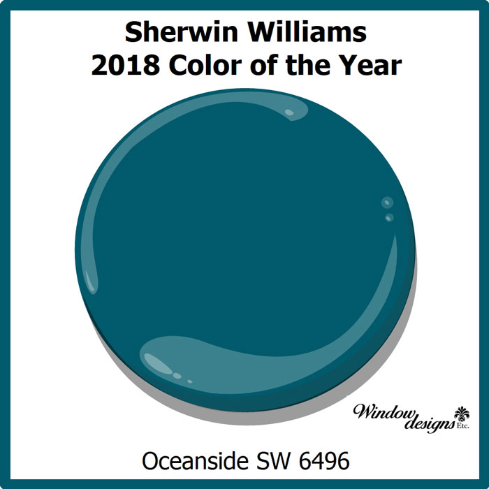
Sherwin-Williams Oceanside is the 2018 color of the year. Leading paint company, Sherwin-Williams made the announcement on October 3, 2017.
Sherwin-Williams 2018 Color of the Year
Pin this ↑
Sherwin-Williams Oceanside SW 6496 is a combination of rich blue and jewel-tone green. It is a deep and complex color that has a sense of familiarity with a touch of the unknown.
According to Sherwin-Williams, Oceanside contains blue which is the favorite color worldwide. Blues evoke intelligence, honesty and interest.
Sherwin-Williams Oceanside
Pin this for future reference.
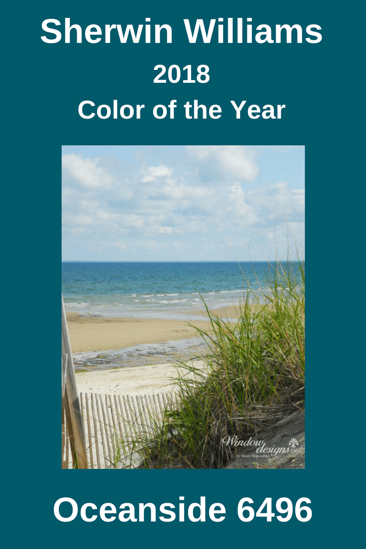
Oceanside is marine-inspired, like the colors in the depths of the ocean. You can see the color Oceanside in the waters of Cape Cod Bay in the photo above.
It is universal when it comes to design style, is evident in what’s old and new. It transcends from traditional to contemporary design styles.
- Painting your front door Oceanside will create a welcoming statement.
- An office in this rich blue-green will boost creative thinking and clarity.
- Adding Oceanside to your bedroom, a yoga room or a reading area will stimulate meditation and self-reflection.
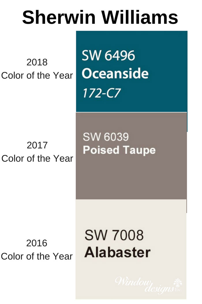
Past Sherwin-Williams Colors 2018-2017-2016
The selection of SW 6496 Oceanside as the color of the year is quite a departure. Near neutrals have been dominant the past few years.
I couldn’t be happier!
Let’s get out of this “safe” neutral color zone.
We need to put some personality, life and happiness back in our homes.
2017 color of the year is Poised Taupe, a neutral blend of warm brown and cool grey. Poised Taupe SW 6039 is a medium color tone that is natural, weathered and balanced.
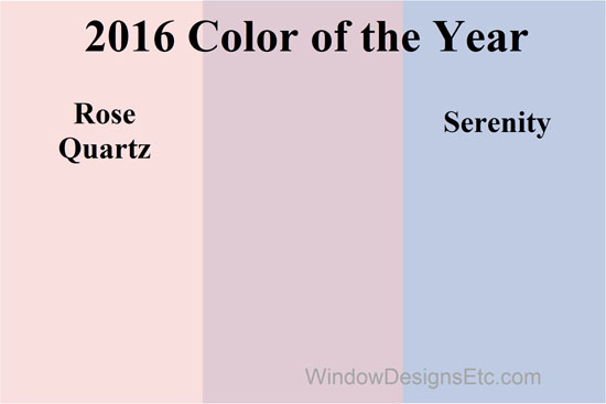
Alabaster SW 7008 is the Sherwin-Williams 2016 color of the year. Alabaster offers a sense of personal solace and rest for weary minds. 2016 was an election year creating a lot of commotion and overstimulation. (How many times a day do you look at your phone?) Alabaster is a true neutral.
I repeat, safe, neutral and boring.
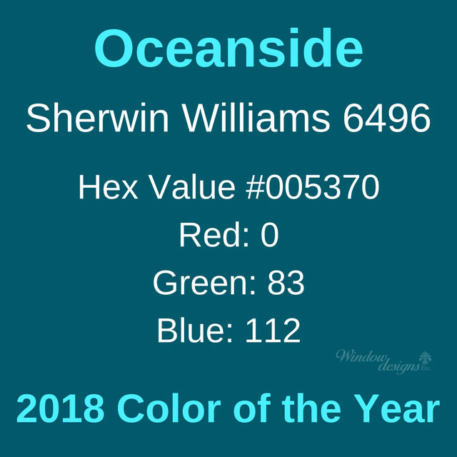
Oceanside SW 6496 Color Values
“People today have a growing sense of adventure, and it is making its way into even the coziest corners of our homes. We are craving things that remind us of bright folklore, like mermaids and expeditions across continents,” says Sue Wadden, director of color marketing at Sherwin-Williams.
Sherwin-Williams Oceanside has depth of color. It is versatile across design styles. Oceanside is easily incorporated into many color schemes. Yes, it will liven up even your cool gray walls!
Expect to see deep blue with a touch of green all across the home decor industry.
Designer Note
Sherwin-Williams Oceanside is their 2018 Color of the Year.
This does not mean you should change all of the walls in your home to Oceanside.
Begin adding small amounts of the IT color into your home and even your wardrobe.
A pillow here, a throw there, a picture frame, some pottery or fresh towels for the powder room.
Keep your eyes open for this new color. You will begin noticing it everywhere.
***Please be aware that computer and mobile device screens display color differently than in person***
Contact me if you would like your own paint swatch.
I’m ready to help you bring Oceanside into your home and office.





I do love this color. I think they picked a good one.
I’m in love with this color. Cant wait to use it in a room.
I am absolutely in love with this color! I think they chose wisely and look forward to using it in homes!!
Nice, this was very informative and excellent tips how to use this color in the home! I do love this color!
I love bright bold colors and Sherwin Williams Color of the year seem to be in line with that.
I am SO in love with this color. I might have to repaint my front door, again!